The City of St Paul
In this project I conducted qualitative and quantitative research to provide stakeholders with recommendations for short-term and long-term changes to their website
Overview
The City of St. Paul Public Works Department sought to understand how its primary users navigated the existing site and where they could start making incremental changes in anticipation of a website redesign.
Stakeholder Goals:
Get a better sense of what primary and secondary users are looking for and how they currently search for that information
Combine the garbage & recycling site pages in a way that reflects the users ideal experience
Knowing there would be a website redesign in the future, wanted to understand things they could do today that could have immediate impact.
My Role:
Evaluate the current usability of the platform
Identify key areas for improvement
Report to stakeholders recommended changes
Research Methodology:
Heuristic analysis of current site
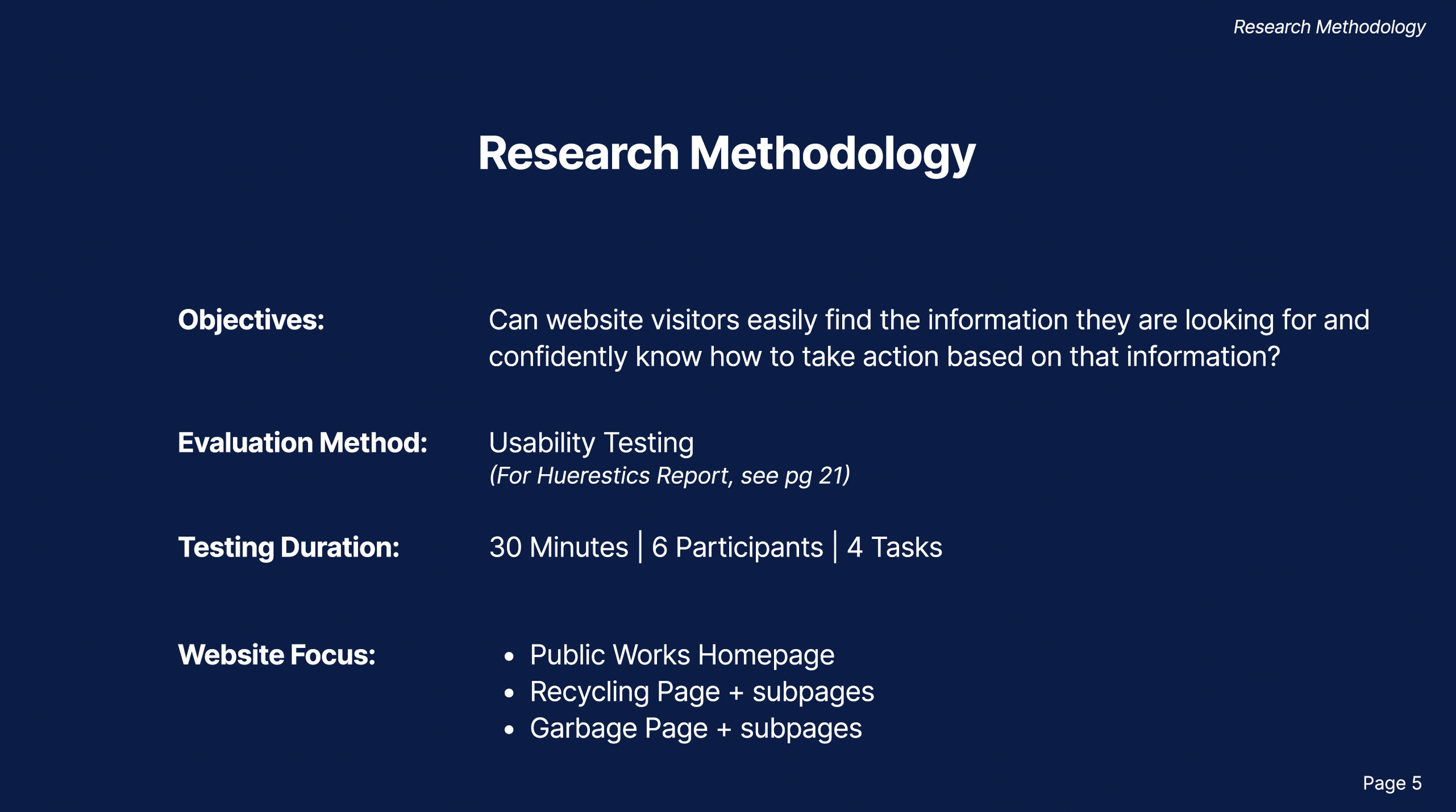
Conduct usability tests with 6 participants
Identify pain points with affinity mapping
Analyze website data analytics to fill in gaps
Deliverables:
Identified 3 key challenges that could be solved for within 0-3 months (low-mid effort, mid-high impact)
Identified one larger severe issue and provided a short term solution pre-full-site-redesign (high effort, high impact)
Delivered PDF to stakeholders with recommendations
Research Process:
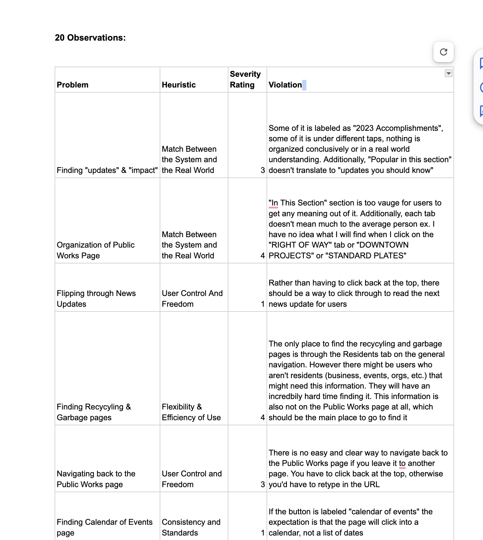
Heuristic Analysis
Evaluated the city’s website using Neilson’s 10 Usability Heuristics to understand its overall functionality and identify potential design issues that users run into while searching for information. This helped in scoping requirements for usability testing.
Snapshot of Heuristics Report
Usability Testing (Qualitative)
Collaborated on a 4-person team to develop tasks & write a usability testing script. We used this script to conduct 30-minute, virtual testing sessions with 6 participants who fell under the city’s primary and secondary user groups.
Affinity mapping to help
synthesize results
Site Analytics (Quantitative)
Analyzed website analytics data to understand where it overlapped with our qualitative research, where it differed, and to identify what other areas of research may need to be done. This also helped me interpret more of the story behind the numbers.
What I found in my research:
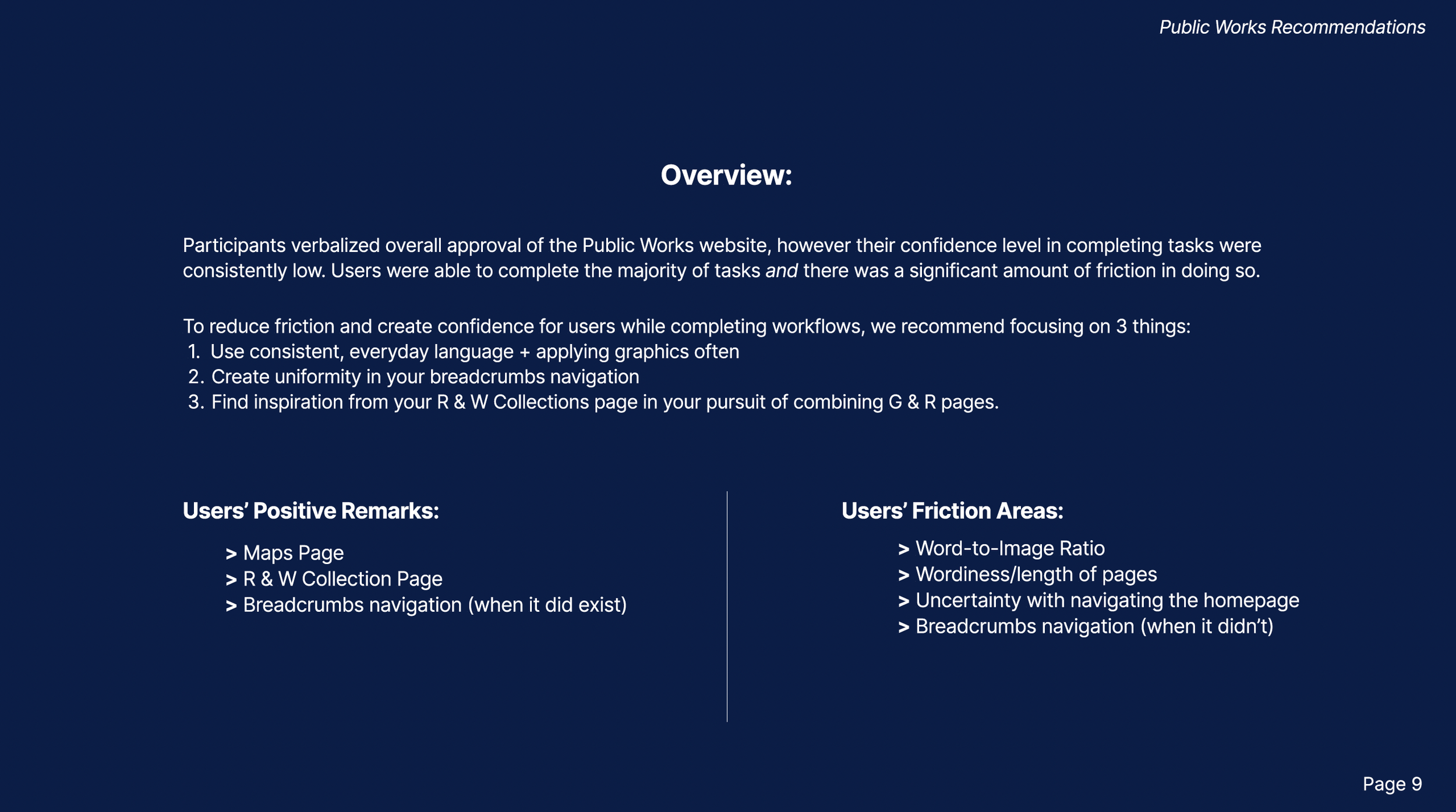
Participants verbalized overall approval of the Public Works website. However, their confidence levels in completing tasks were consistently low.
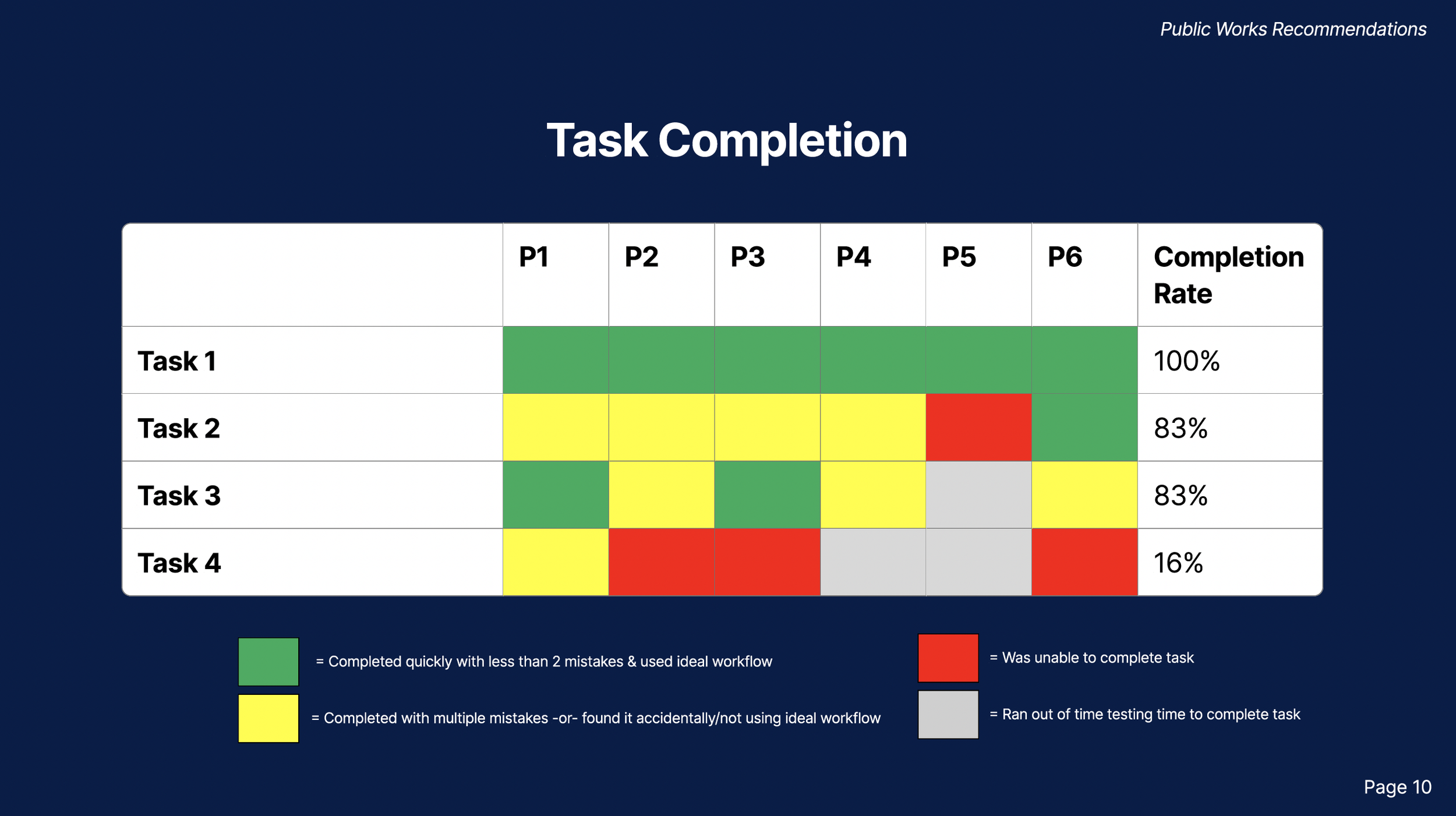
Users were able to complete the majority of tasks and there was a significant amount of friction in doing so.
Uncovered Pain Points:
Primary User Groups:
Residents of single-family houses looking to manage their waste appropriately
Multi-unit apartment dwellers looking to manage their waste appropriately
Secondary User Groups:
Community Event Planners concerned with proper disposal procedures
Special Waste-Generating Hobbyists looking to dispose of their materials properfly
Locating Information Quickly (medium severity)
84% of users failed to find when the next recycling drop-off event is
27% of users failed to learn where they could dispose of a couch
27% of users were unable to determine when garbage pickup day is
Pain Point #1:
Pain Point #2:
Usability issues with Main Navigation (high severity)
100% of users clicked the wrong link when trying to navigate back to the Public works page
75% of users tried to rectify their mistake by using the main navigation
Out of the users that tried to use the main navigation, only 1 person was able to locate the correct page
The final deliverable for this project was a Usability Findings and Recommendations report given to the stakeholders of the City of St. Paul’s Public Works department.
Recommendations & End Results
Design Recommendations:
Language & Graphics:
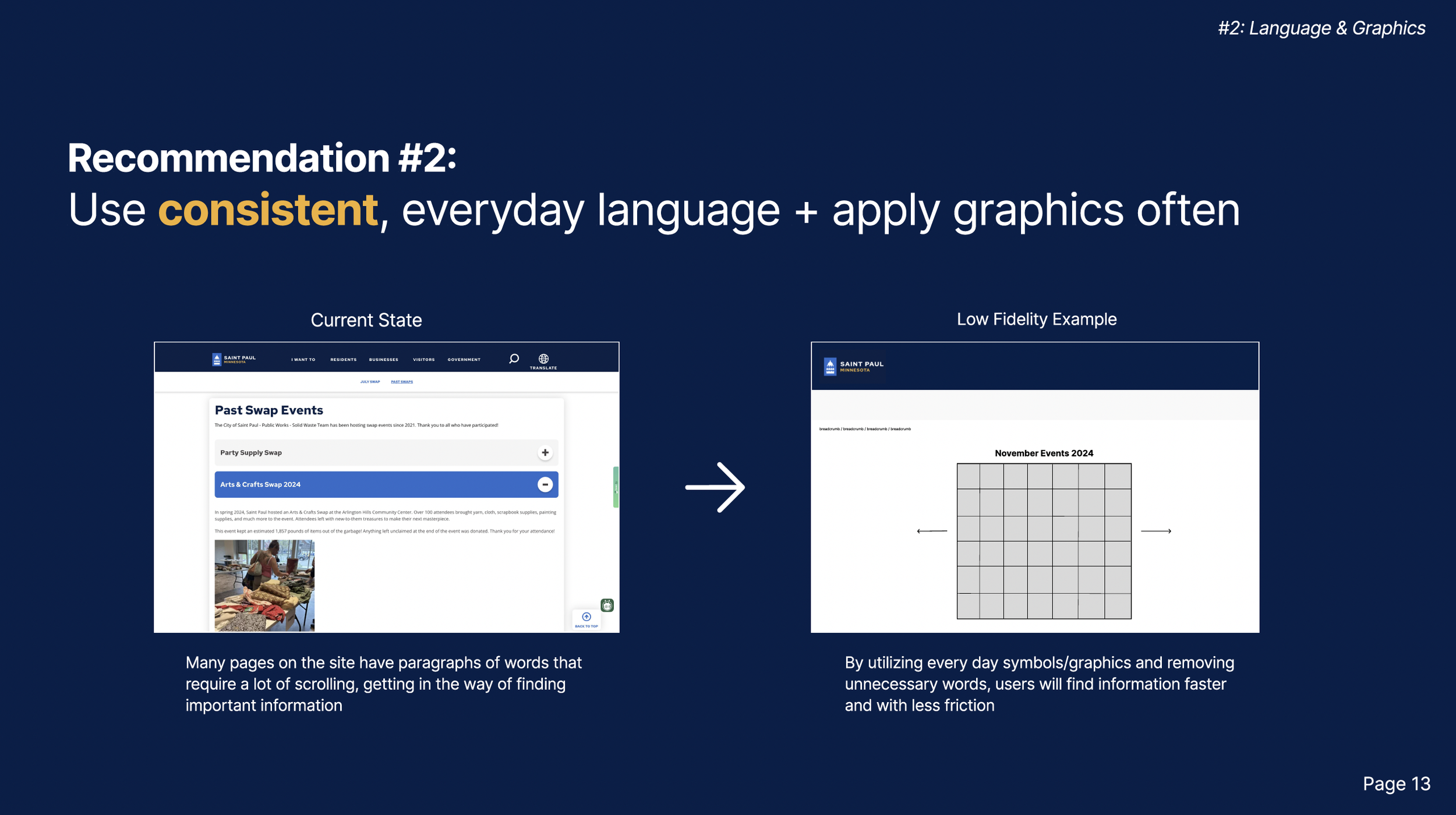
0-3 months: conduct additional usability tests with a focus on language and understanding how users speak about the topics they are looking to find3-9 months: update content with consistent, user-centric language & apply universal graphics whenever possible to emphasize meaning
Navigation:
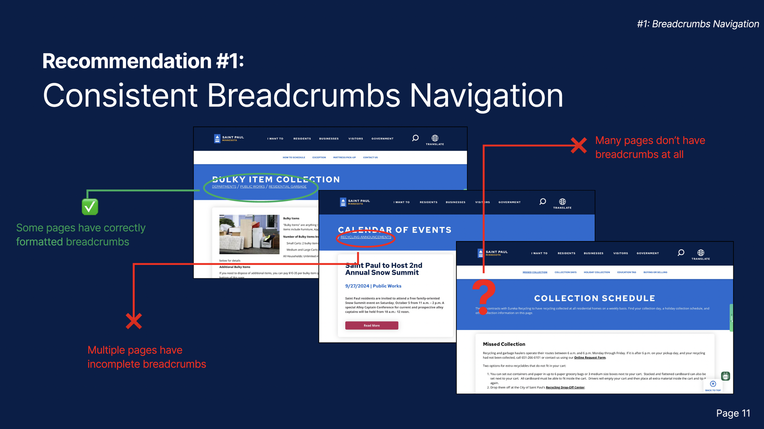
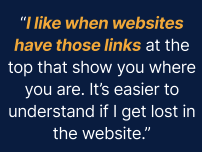
0-3 months: update pages to unify breadcrumbs
3-9 months: update navigation with a clearer POV and verbiageCombining Siloed Pages:
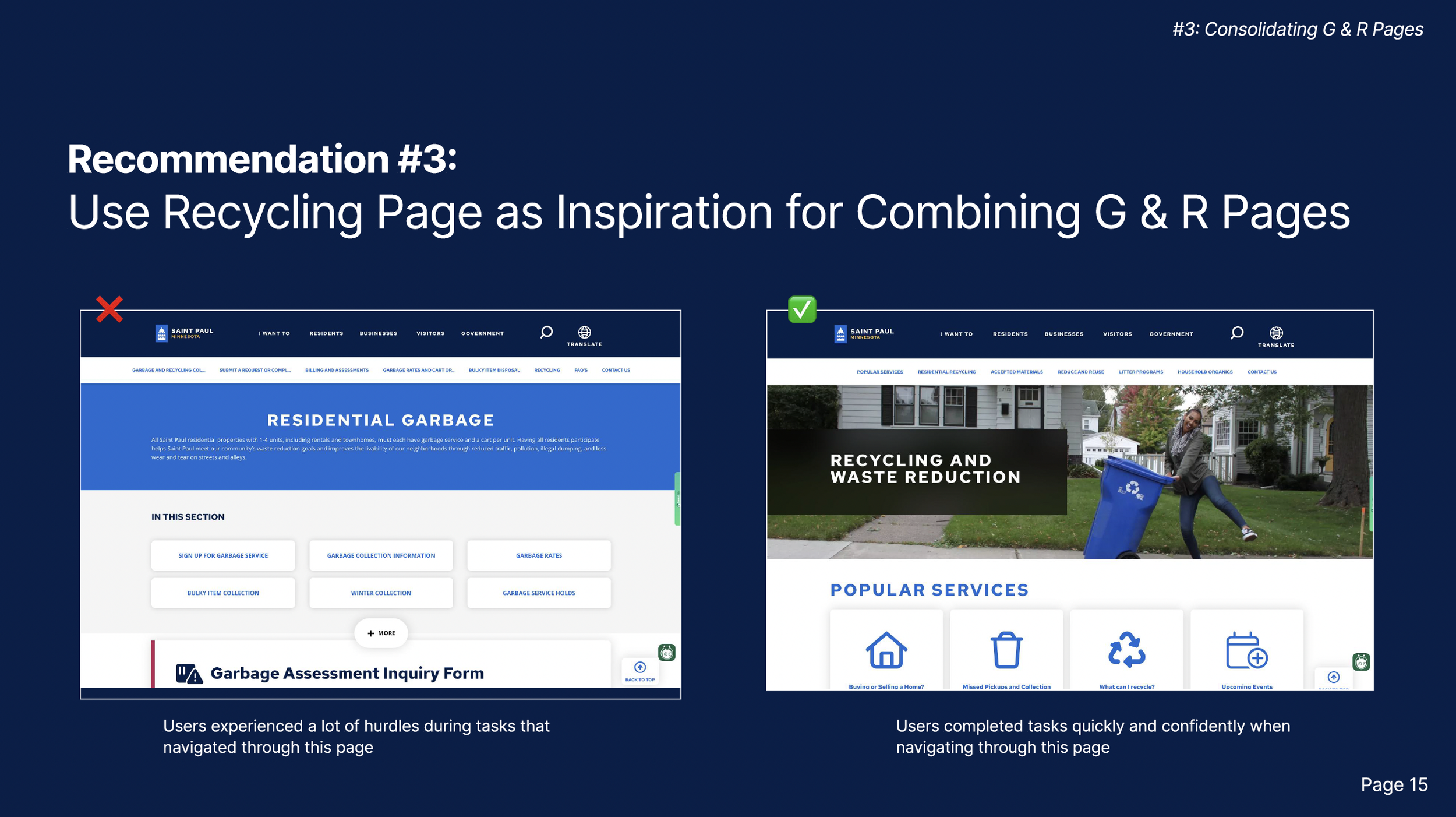
Use the Recycling and Waste Reduction page as the main navigation and fold Residential Garbage content into it.
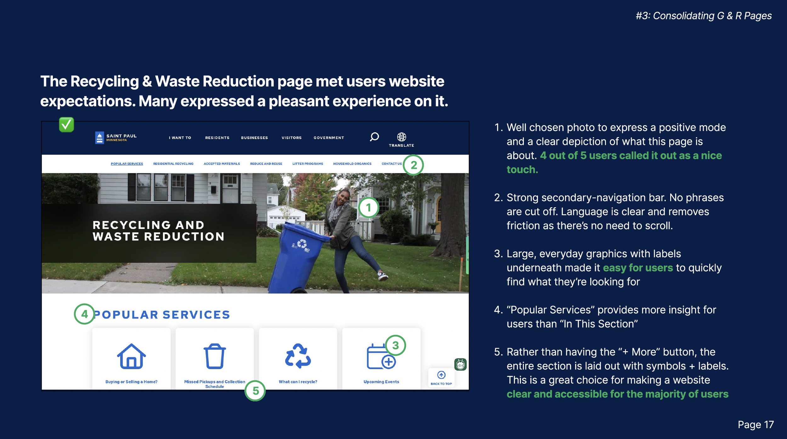
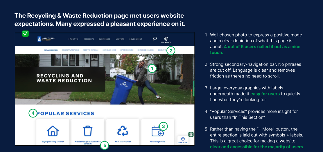
There were also some well-created, thought through pages that the City of St. Paul had already made that were noticeably easier for users to navigate.
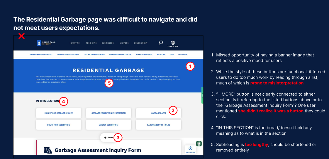
I wanted to make sure to highlight this and explain to stakeholders why these pages worked and how they were different than the pages that weren’t working.
The Residential Garbage page was not working well for them and was also verified by the Heuristics analysis and usability testing.
Hypothetical Results & Next Steps:
The Recycling & Waste Reduction page was working well for them and was verified by the Heuristics analysis and usability testing.
With the recommendations provided to the City of St. Paul, the projected impact would be a reduction in users leaving the site without finding important information, an improvement in simple task completion, and an increase in positive user experience.
This was a pro-bono project for the City of St. Paul, however proposed next steps would be to develop a timeline with stakeholders to project manage the implementation of short and long term changes.
Step 1: Quick Win
We would start small by fixing the breadcrumb navigation issue, as that is a quick win with high impact.
Step 2: Information Architecture Diagram
Simultaneously we would begin work with combining the R & G pages by creating an IA diagram to understand what new pages need to be created, what pages can be removed entirely, and what pages needed to be edited with additional information.
Step 3: Additional Testing
To understand the best language and terminology to use when coming from the primary and secondary perspectives


