The MNsure Healthcare Project
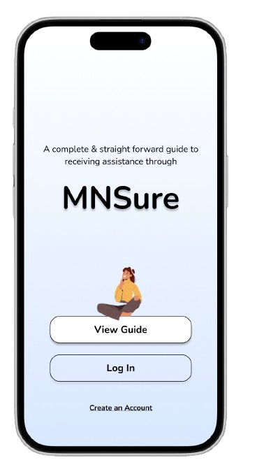
For this project I created a web app that guides Minnesota Residents through MNsure*.
*MNsure is Minnesota’s marketplace for finding health insurance and receiving financial assistance through the state
1. Project Overview
2. Unpacking the Problem
3. Understanding the Users
4. Design & Iterations

PROJECT OVERVIEW:
Near the end of my experience as a UX student, I had the opportunity to work on a self defined, 3-week UX project. I chose to tackle a complex system: MNSure.
My goal was to create a more humane, simplified experience for residents in need of state assistance.
To accomplish my goal, it was important to make sure I was understanding and addressing the biggest challenges with the current system and who they were affecting.
Research Methods:
2 Expert Interviews
3 Directed Storytelling Interviews
5 Usability Tests
13 Design Feedback Surveys
Secondary research via social platforms like Reddit and Facebook
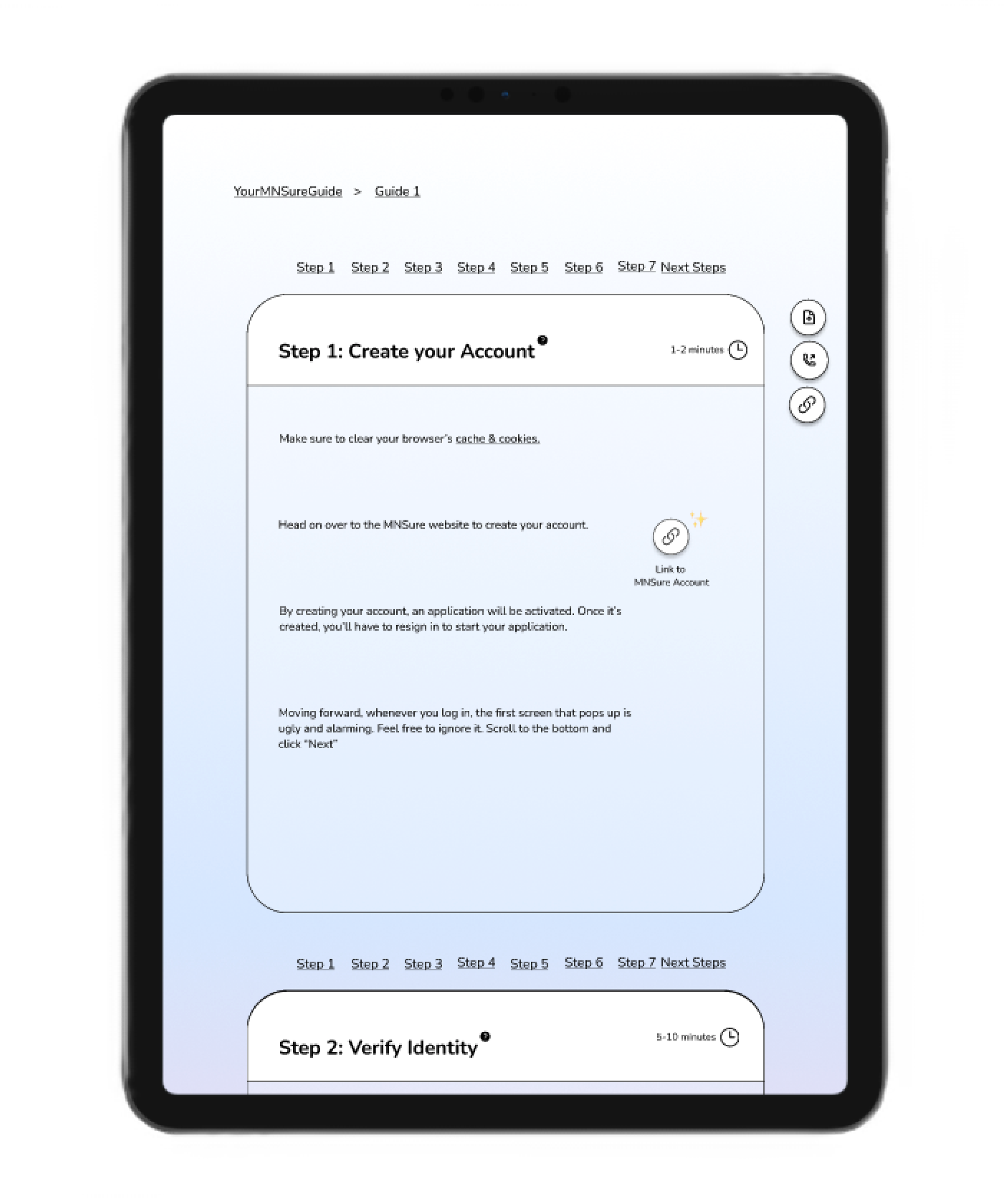
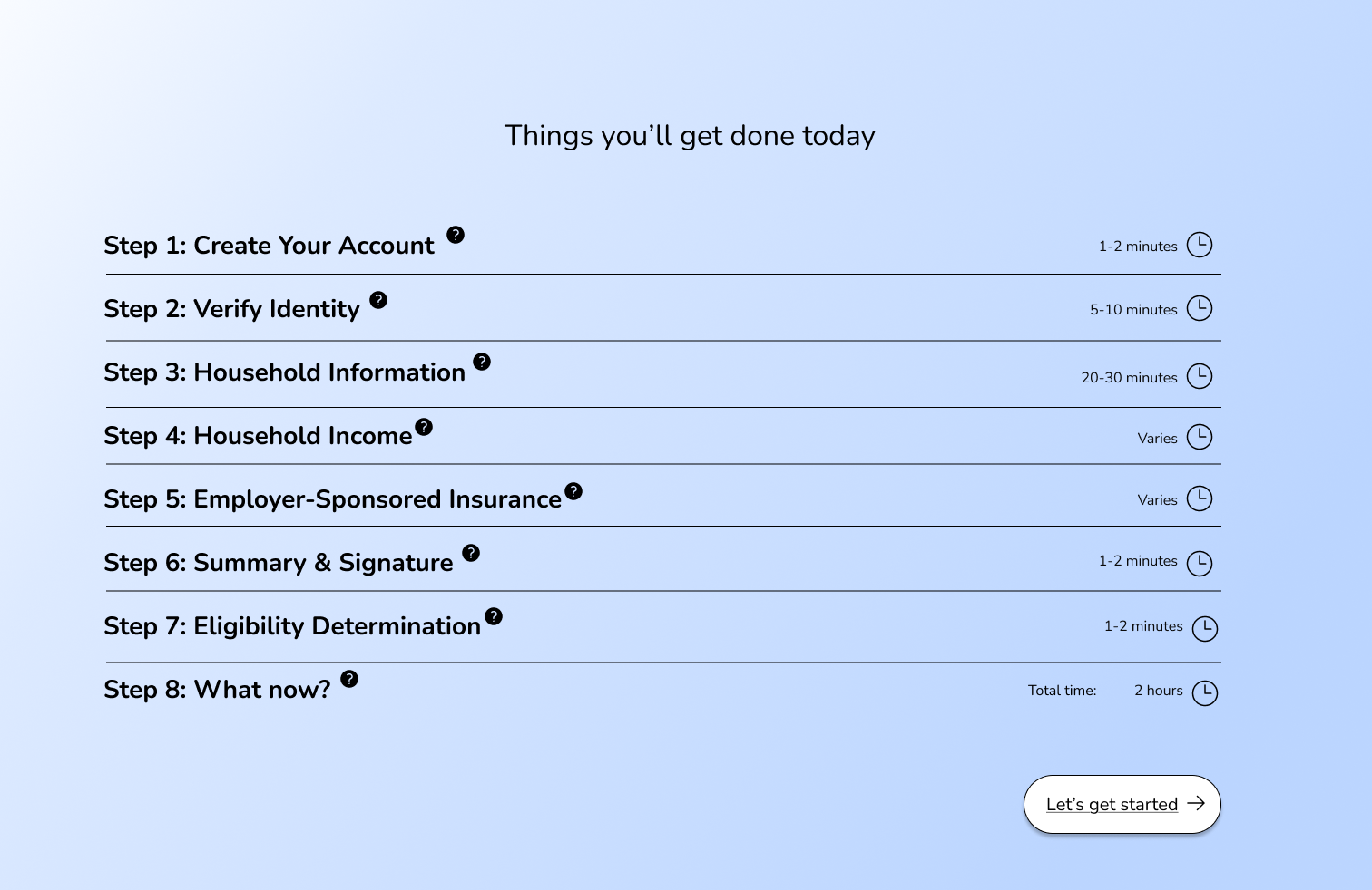
After multiple rounds of research and design, the final output was a minimalistic 7 Step Guide for individuals who are filing for the first time without dependents. The guide is optimized for web-app at full screen and web-app at half screen (tablet). Future work will include a mobile web-app version as well as additional guides like filing with dependents and refiling.
At the end of the 3 weeks I presented my prototype to a group of 30 people.
1. Project Overview
2. Unpacking the Problem
3. Understanding the Users
4. Design & Iterations

UNPACKING THE PROBLEM:
Because there is so much complexity to how state programs work, not to mention how difficult it is to understand healthcare in general, it made it really important to get crystal clear and specific about who the ideal user was for my guide and what the main issues are that I am capable of addressing for this person. Since there are so many different paths, I started by sourcing interviews broadly in order to find through lines for getting more specific.
Initial User Profile:
Female Minnesotan residents in their 20s & 30s
Has had a stressful experience in their process of applying to for MNsure
Research Methods:
Directed Storytelling: 3 Interviews
These 3 interviews were with women who currently use or have used MNsure in the past and had a stressful experience. My goal was to recognize patterns between the interviews, dig into the root cause of where challenges occurred, and be cognizant of how their filing situation is unique or similar to others.
Stories on Social Media Platforms: Reddit & Facebook Groups
Conducting secondary research through these two platforms proved to be a wealth of learning. Because this issue effects so many residents and is such an important topics, there are Facebook groups dedicated to it. By sifting through a lot of these stories, I was able to pinpoint how people felt about the process, what their expectations were, and the knowledge gap that was impacting users negatively.
Usability Testing: 5 Interviews
These 5 interviews were completed with women who have never used MNsure. Meaning they had never been to the website, filled out an application, or experienced the application. This was important for two reasons:
To see if the challenges that were highlighted by my previous interviews and from my secondary research could be replicated and therefore validated
To see how people want and expect to use the platform so that I can write in anticipation of what a user is thinking and feeling.
Expert Interviews
I met with 2 experts and conducted 1.5 hour interviews. One interview was with a woman who worked in administration for a Minnesotan county and helped process applications. The second interview was with a woman who worked at a health insurance company who was able to walk me through healthcare terminology and the common challenges that come up when applying.
By doing these two interviews, I was able to not only receive input on important things to add to this guide, but I was able to unpack additional reasons as to why the issues existed in the first place.
1. Project Overview
2. Unpacking the Problem
3. Understanding the Users
4. Design & Iterations

UNDERSTANDING THE USERS:
User Journey:
I created a user journey that showed where challenges were arriving for users, what questions they had at which steps, how to tell if a specific challenge was out of scope, and massive roadblocks users were experiencing that needed to be addressed.
Creating this User Journey taught me:
What was out of scope for this project
What was in scope for this project
The types of questions I would need to address in the guide
What are primary roadblocks for users (issues that are causing them to not move forward with the application
What are secondary roadblocks for users (issues that are causing them to struggle or put off completing their application)
Additional roadblocks (issues that are less common but notable for being a reason someone isn’t receiving assistance)
Information Architecture Diagram:
I created an IA diagram of the current MNsure website and application. This gave clarity into how the websites resources and process were informing the user journey and creating roadblocks.
Important insights:
This website is complicated because there are so many potential requirements that are important but cater to small minorities
Important information is mixed in with less important information and there is no hierarchy
80% of the information on the website is irrelevant to most people
While simultaneously, all of it is extremely important
5 Major Insights
1.
Most of the website information is irrelevant. However when it is relevant, it’s extremely important & needs to be highlighted/addressed
2.
When asked, none of the 10 people I interviewed could give me the correct definition of what MNsure is and how it functions
3.
There were two clear problems that all people faced and were the largest issue:
Little to no accessibility to a fax machine
Not being able to wait on hold for 2-5 hours to talk to someone at MNsure
4.
When action needed to be taken by the resident, it wasn’t clear what the action is or how to perform it
5.
Residents were only able to fix specific issues with their application when someone from the office answered their call. When they did finally receive an answer, the issue was typically fixed within minutes.
Finalized User Profile:
Female Minnesotan residents in their 20s & 30s
Has had a stressful experience in their process of applying to for MNsure
May have dependents but are filing independently
Filing due to unemployment -or- the cost of employer insurance is more than 8% of their annual income.
First time filing
United States citizen
1. Project Overview
2. Unpacking the Problem
3. Understanding the Users
4. Design & Iterations

DESIGN & ITERATIONS
How might it look if the website was structured based on how the customers would like to feel, rather than how the cities/counties operate?
Testing & Iterating
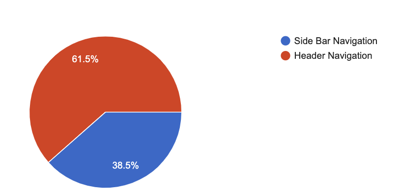
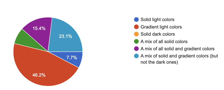
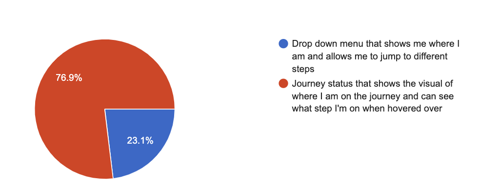
To test out how users feel about different website experiences, I created two prototypes and surveyed 13 people about their preferences. The two prototypes had the same content, language, and purpose. However they differed in experience as one was a horizontal click prototype and the other was a vertical scroll prototype. One had graphics with animation, the other did not. One had a large variation in colors, the other did not.
Here are some of my findings:
Design Kit
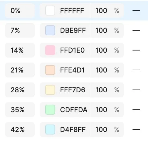
My goal with my color palette was to create a sense of calm for users. It should feel similar to a meditation or self-care app in order to offset the anxiety that typically comes with applying for government programs. I focused on a light blue that is followed by pastels, finding a balance between uniformed and interesting. Applying a gradient was intentional because of the nature of the guide as a vertical scroll. The gradient created an accordance that implies there is more for the user to see if you continue scrolling down. The change of colors follow the change in steps, making it easy to understand you are continuing along the path to completing your application.
Primary Gradient #BBD5FF
Secondary Gradients
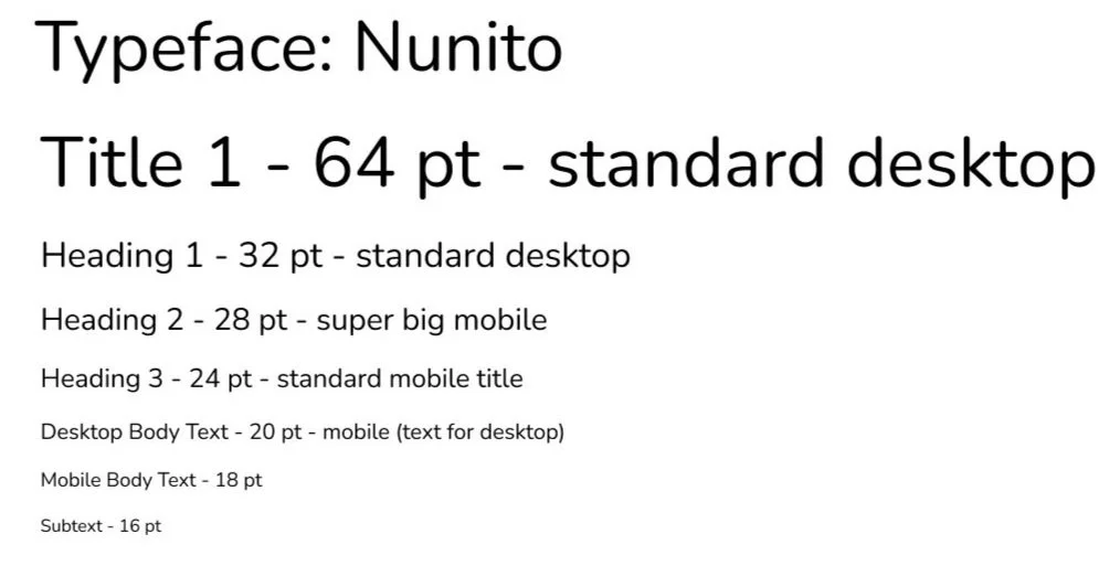
Nunito was decided for the typography. The goal here was to use something simple that did not interfere with the information being presented. I considered having separate heading and body fonts, but because by big-picture aim was simplicity, I decided to stay with one uniformed look and utilize type sizes and spacing to distinguish hierarchy.
Graphics incorporated from Unsplash
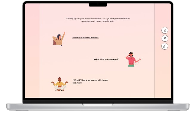
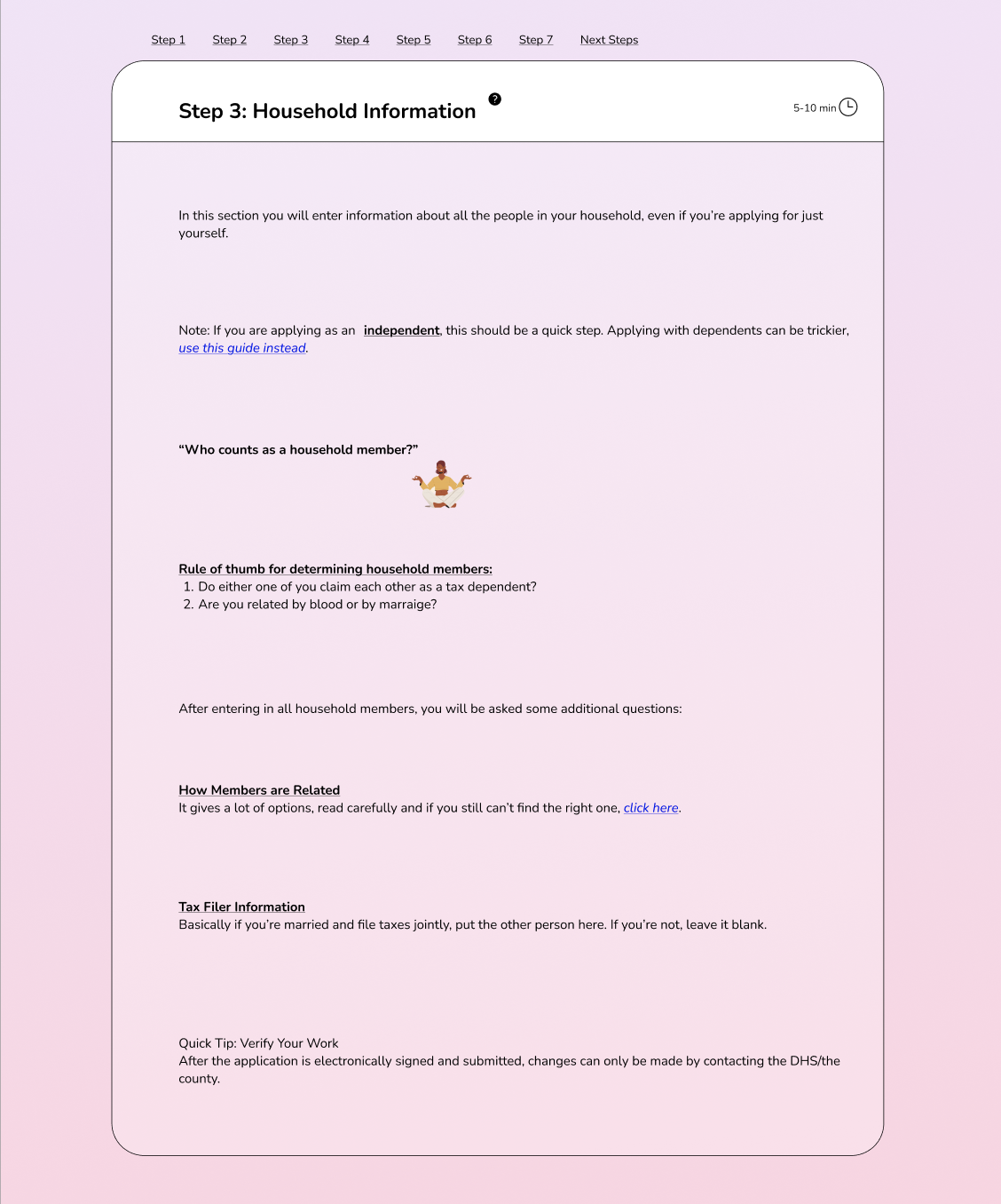
1.8 million Minnesotan residents receive some sort of assistance from the state in order to access healthcare insurance. I wanted the people using this guide to feel less alienated as they were navigating the process, leading me to include graphics of women doing activities they enjoy.
The Final Design:
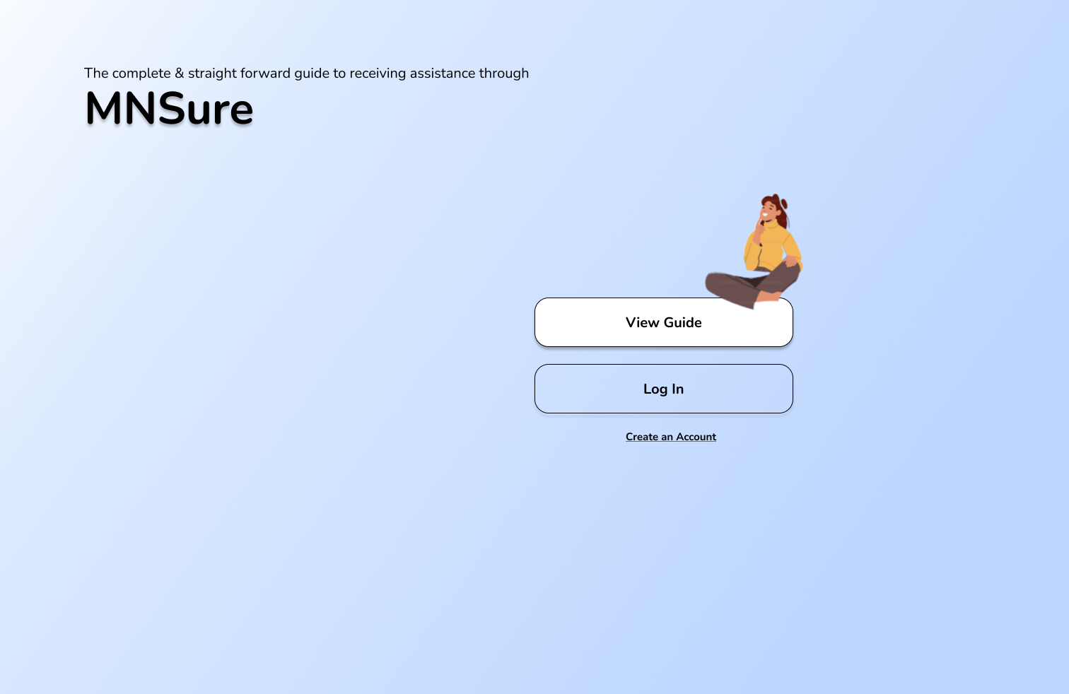
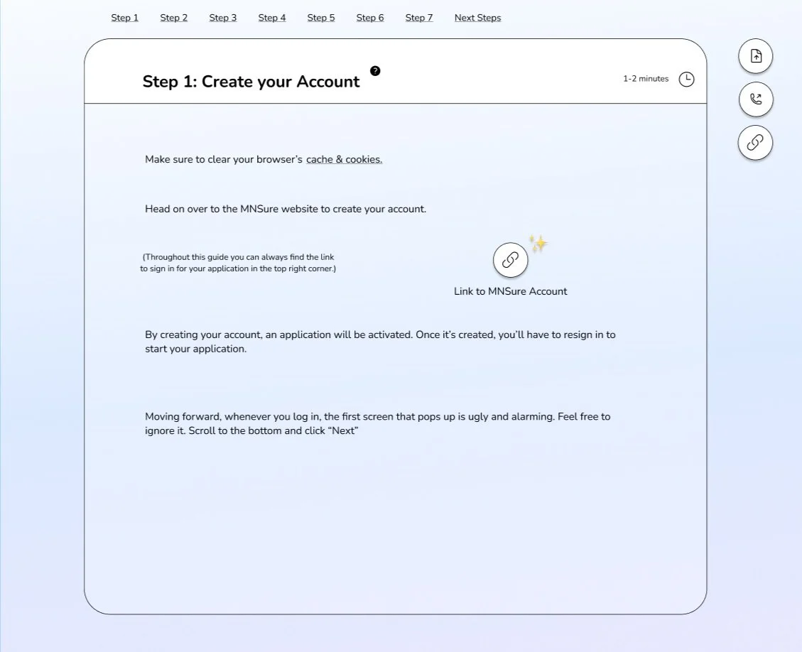
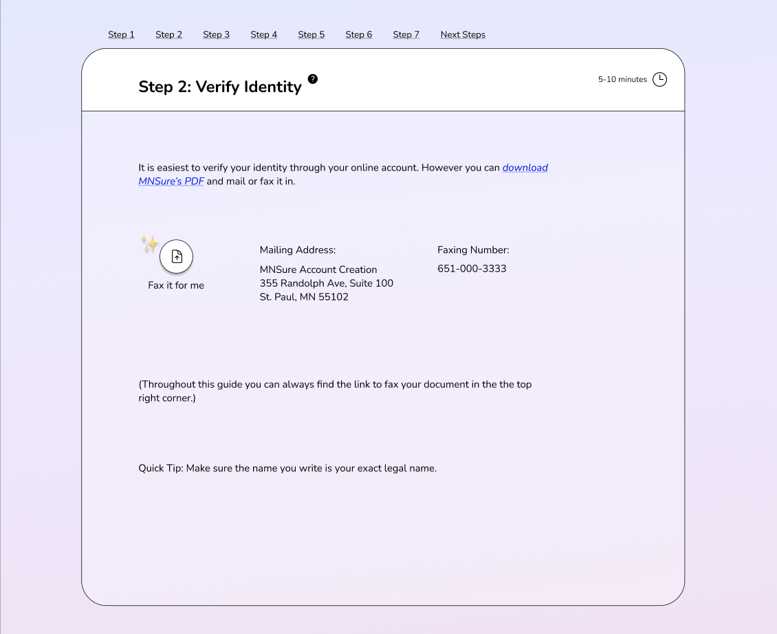
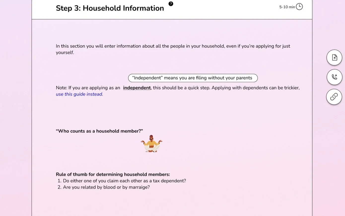
With the depth of research and synthesis I did, I was able to create an initial design of a guide that helps users navigate the MNsure application process successfully. The final prototype is a vertical scroll that incorporates soft, pastel gradients and personable, happy visuals to create an anchoring experience.
The biggest problem that needed to be addressed with my guide was cognitive overload. The website simply has too much irrelevant information,
To solve, I used progressive disclosure with 4 different layers.
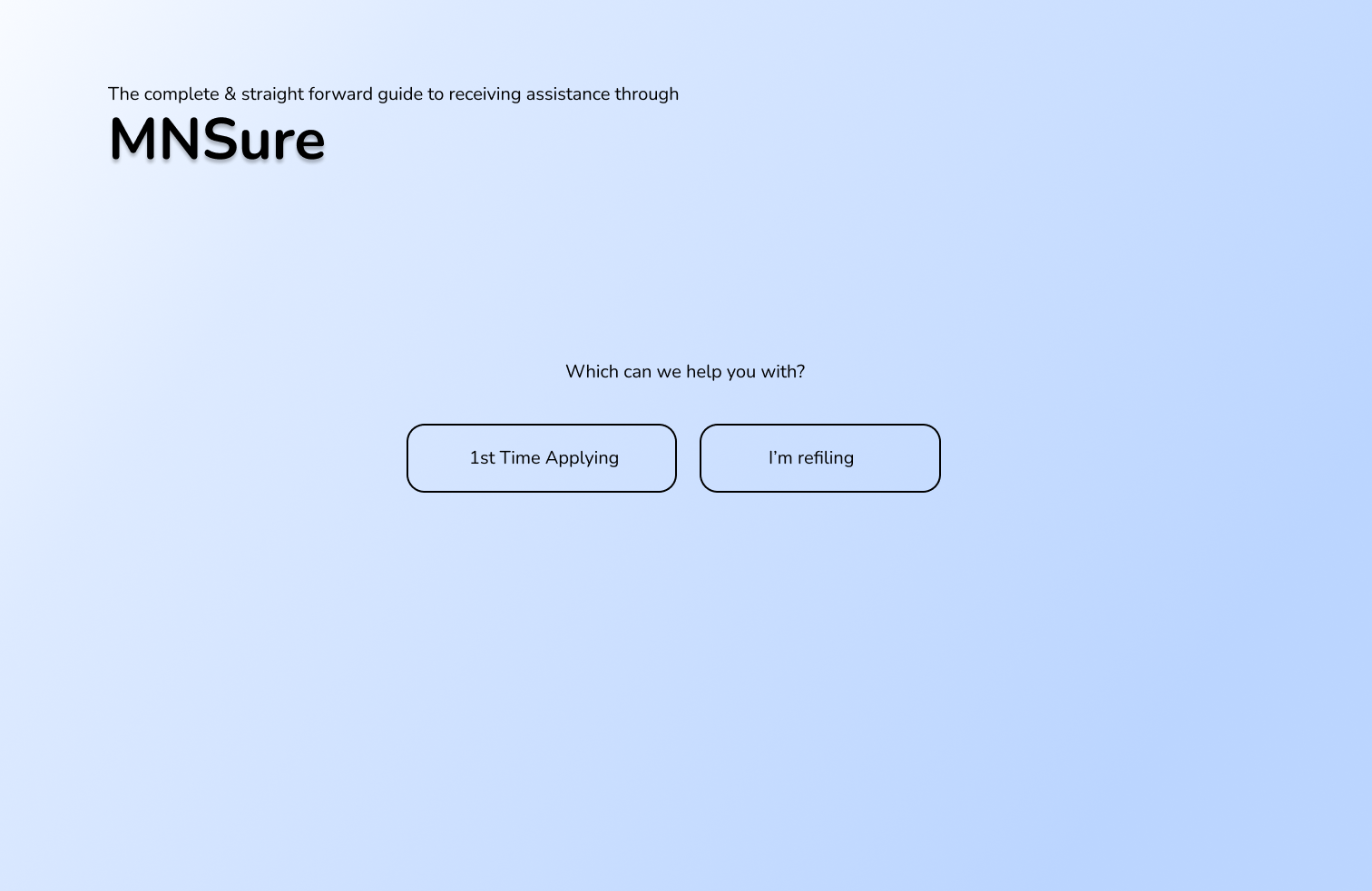
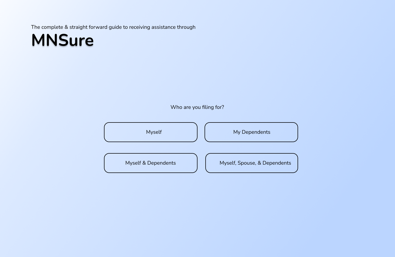
Layer One - In order to access the correct guide, you need to answer 3 preliminary questions. This points users in the right direction of only viewing information that is relevant to their specific use case.
Layer Two - Visible content for each stage should be limited to 1-2 sentences with spaced gaps between points.
Layer Three - Each step has a clickable question mark that assists with trouble shooting, provides context for the step, and shows potential trouble areas to watch out for. Additionally, FAQs are scattered throughout that can be clicked on to see answers.
Layer Four - Technical terminology can be hovered over to reveal a definition overlay
