tinkl
OVERVIEW:
tinkl is a bathroom finding mobile app that helps trans, non-binary, and gender-nonconforming individuals locate safe restrooms in their city. I designed a web based administrative tool to provide an easier workflow for the tinkl’s engineering team to manage their daily tasks.
Design Process:
Preliminary research:
I conducted a cognitive walkthrough of the current application
I worked with the founder to understand their current and future state
I interviewed a team member to learn how they currently managed daily tasks
3 Findings:
They needed a system that supported their mental model today and supports future features the team may have to manage as the web app expands.
They wanted the ability to see at-a-glance what work had to be done on any given day (most of the team was volunteering their time to manage the app, so knowing what tasks need to be completed right away is important for their time management).
They wondered if there was a way to see mistakes when they were made and have visibility into each others work for collaboration and trouble shooting
I turned my 3 findings into 3 concepts:
A strong navigation that is intuitive for today and expansive for tomorrow
A dashboard and task pages that provides immediate insight into what the day looks like
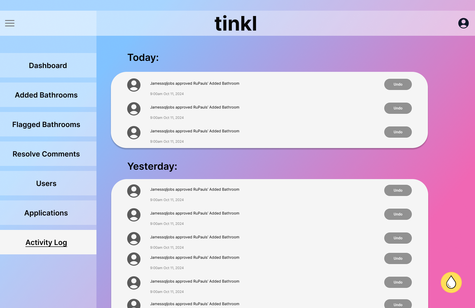
A management log that provides a history of completed user tasks and can be undone when needed
Before:
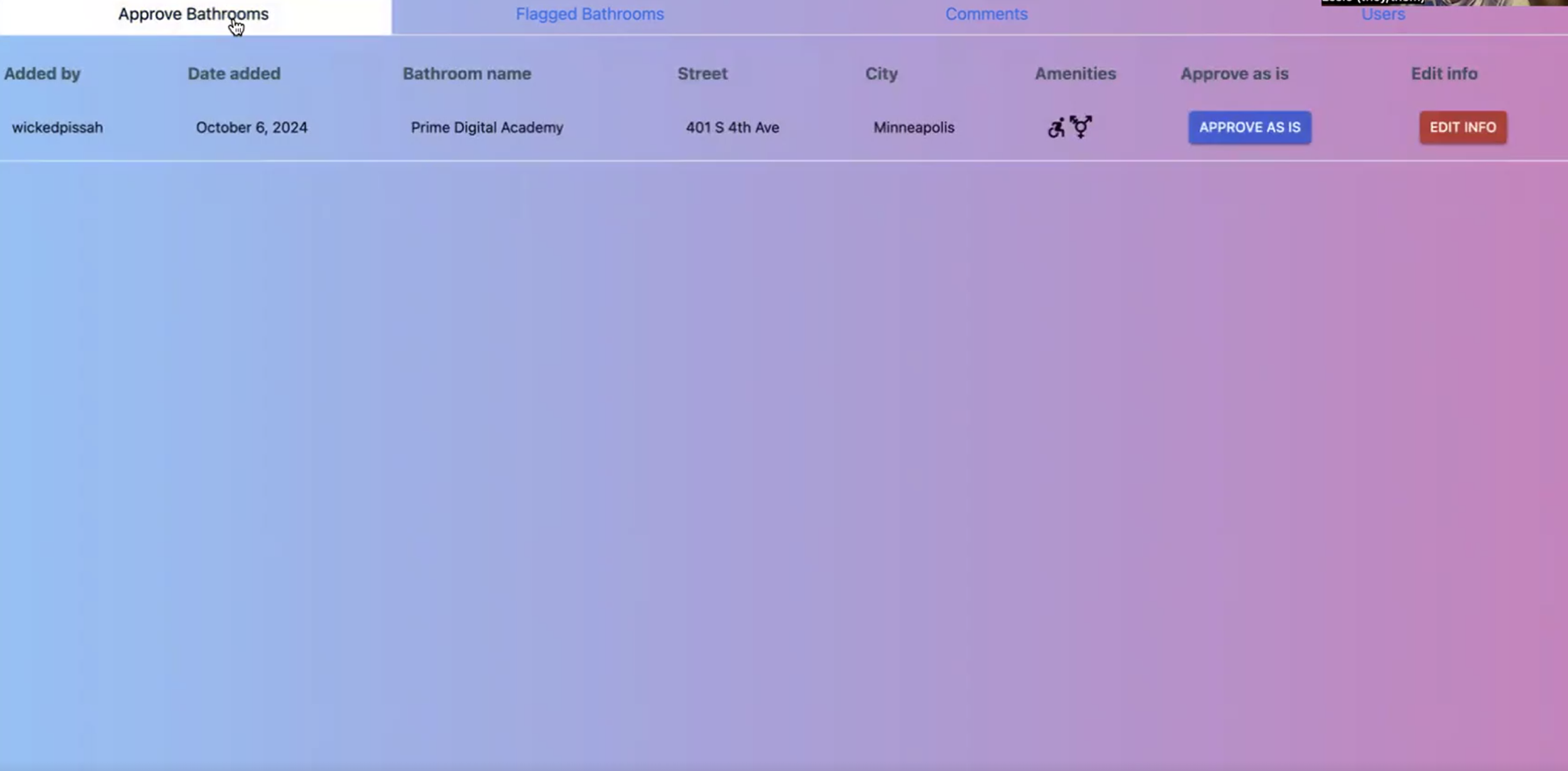
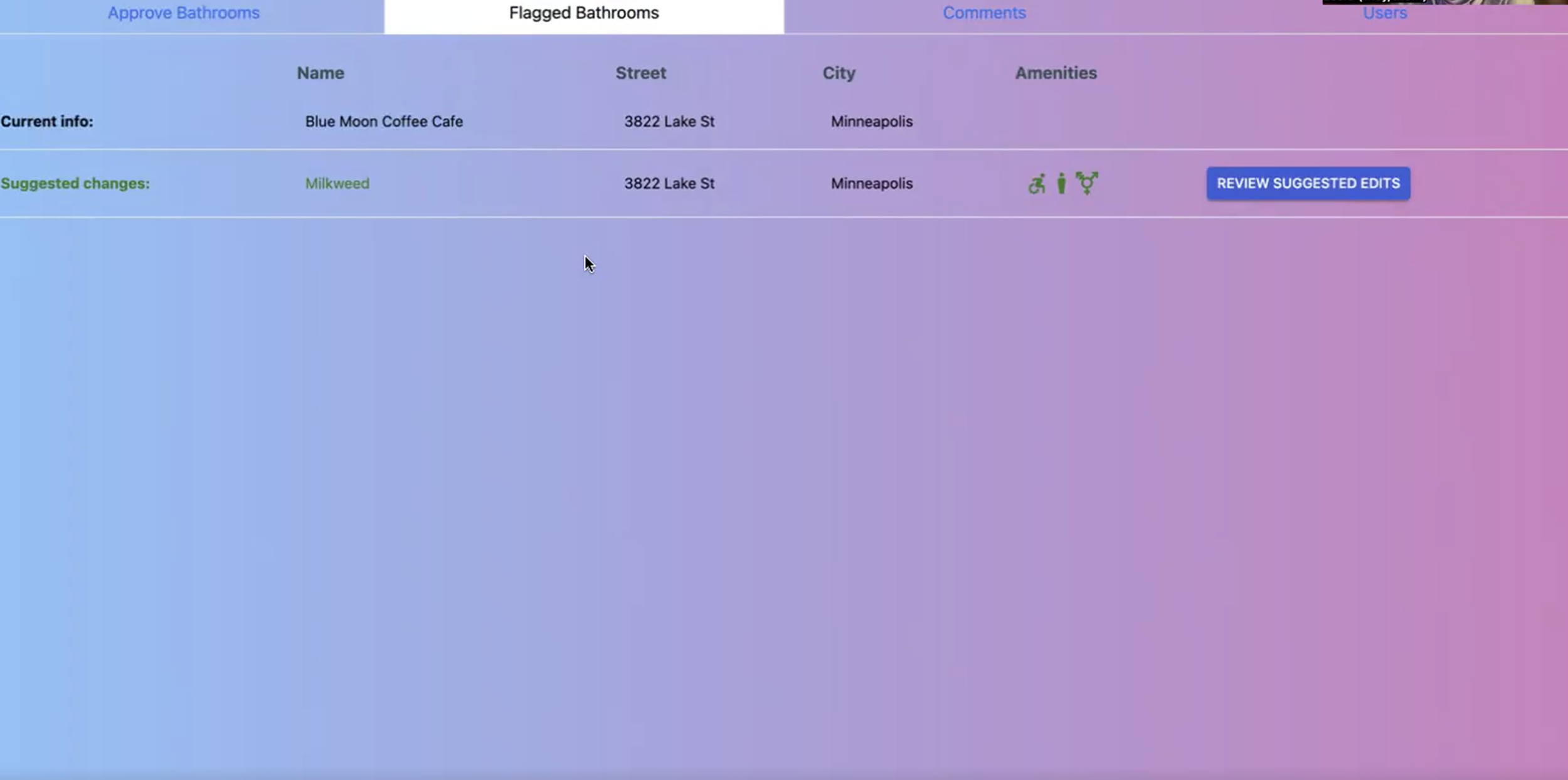
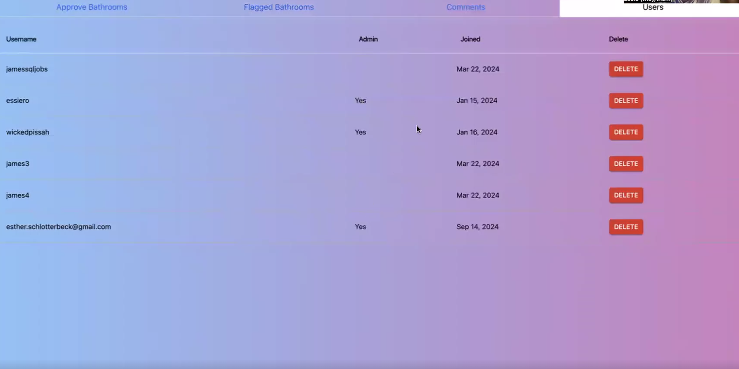
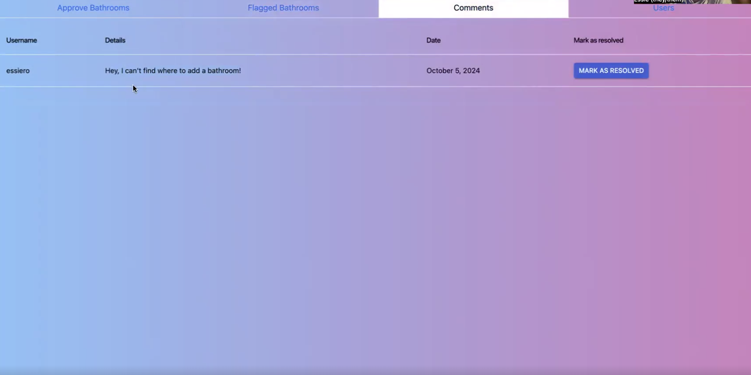
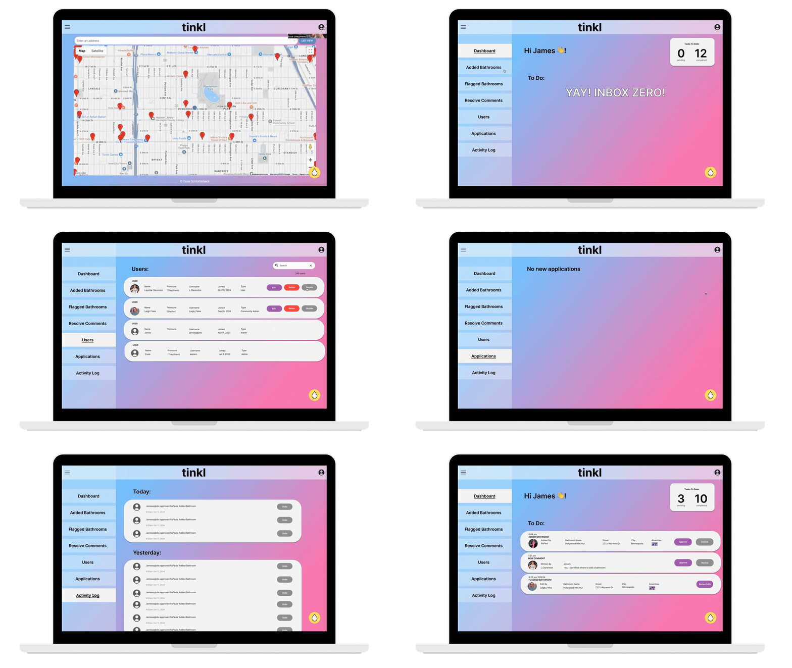
These 4 screenshots are from a video walkthrough of the original prototype the founder created and had asked me to expound on. Each screenshot represents 4 different tabs:
Bathrooms > where an admin goes to approve new bathrooms
Flagged Bathrooms > where an admin goes to review what members have flagged
Comments > where an admin goes to for reviewing comments
Users > where an admin goes to to manage members
After:
Demo of the updated admin tool I created for the team
Design Decisions:
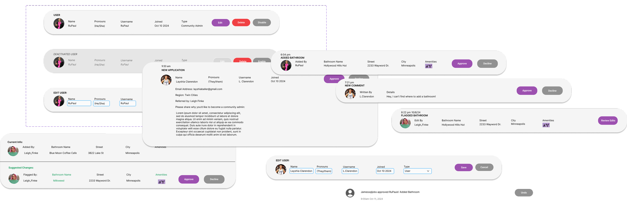
CREATING TASK CARDS
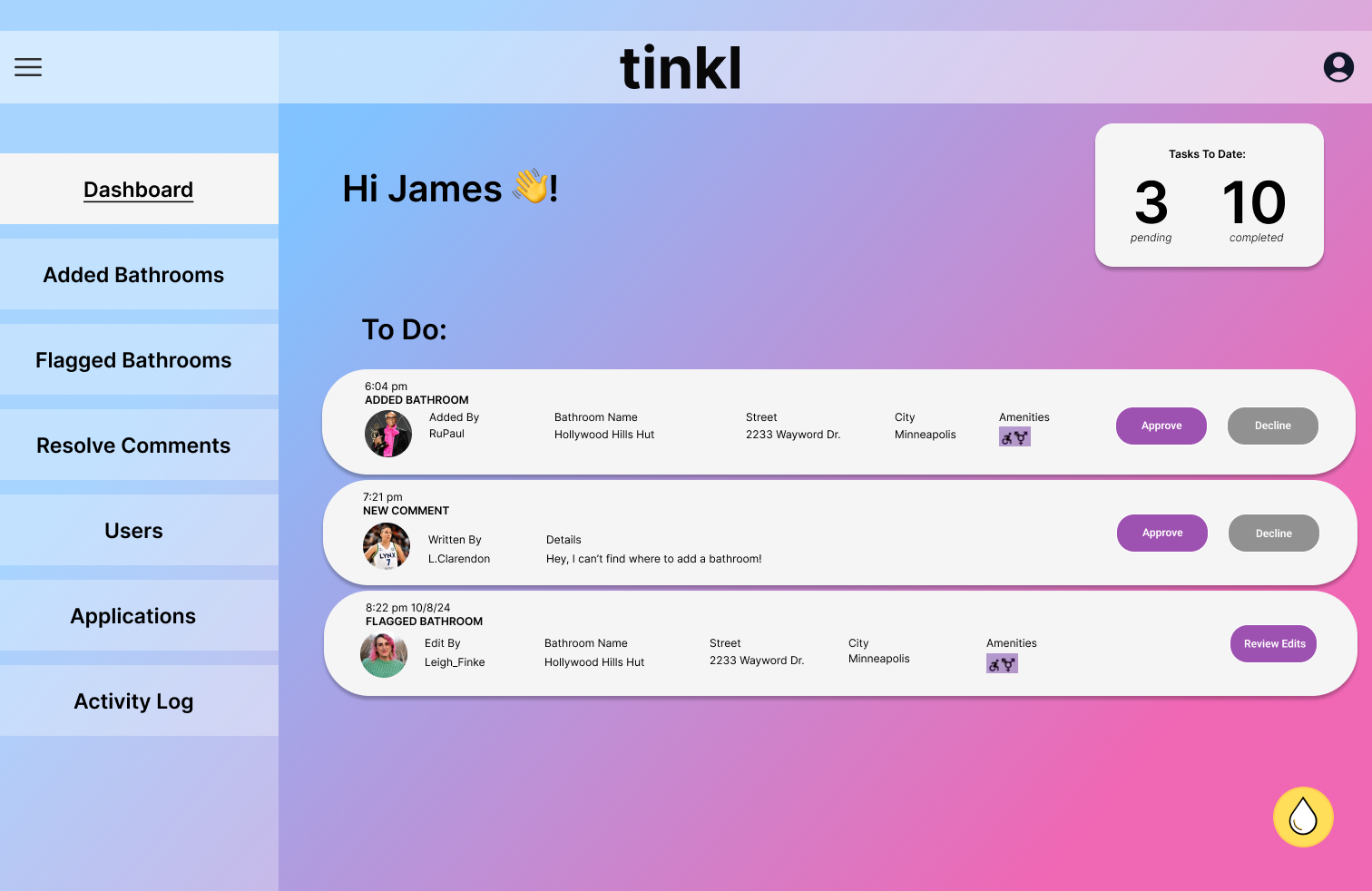
Wanting to make the organization of the dashboard easy and uniformed, I created component cards in Figma using a color that is high contrast to their background. This made it exponentially easier to see the clearly defined tasks and the options for completing them. This created a visually appealing and easily digestable way for users to manage their work.
REORGANIZING NAVIGATION
Project Takeaways:
As mobile apps grow, new customer features require additional management by employees. With how much growth they anticipated throughout the next 3 years, I wanted to make sure their navigation was set up in a way that they wouldn’t need to recode its design in order to expand its functionality. I moved their navigation bar to the left hand side (per standard mental model) and made it expandable for optimizing working space.
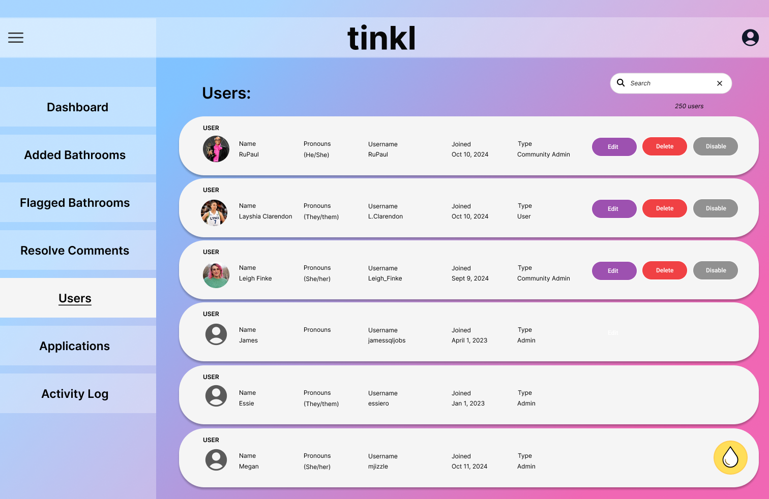
Additionally, I relabeled and reorganized some of their task options in order for a more intuitive experience that allowed for more activities that an employee might need to take (for example, users could only be deleted or disabled in the initial prototype, I created a third option for them to be edited directly in the web app).
NEW FEATURE: ACTIVITY LOG
During my interviews, I learned from the founder that they wanted some sort of archive of what employees or volunteers have done previously. This was important especially as they grew to allowing community members to become voluntary admin, which would make them more susceptible to errors. There was an additional problem that I heard expressed around how, in todays current process, if there was an error made by an admin they would have to go to the hard code and rewrite the mistake out.
Hearing these issues, I came up with a new Activity Log feature that solved all of these issues with one solution. By adding the log, the admin would now be able to see which member was completing what tasks and when someone completed a task incorrectly, it was now really easy to undo the task.
Key Takeaway 1:
With every small feature I wanted to add, there were multiple considerations to think through while prototyping in Figma. This was a big lesson in creating reusable components and how to strategize what needed to be done first in order to not run into design issues later. I learned how to be more efficient in my work and make sure I wasn’t missing any key interactions.
Key Takeaway 2:
There is so much functionality that can be built for an administrative tool (especially when you’re starting from scratch!) and so many fun features that can make work easier. But there is a difference between having great features to do your job better and having too many not-needed-yet features that could make it a hinderance to getting daily work done.
Key Takeaway 3:
You don’t always need to reinvent the wheel. As I was starting this project, I was really excited for it because I was pretty much designing the new tool from scratch. I had a lot of creative ideas that were new and exciting, but as I continued my initial research I realized that there is already a pretty clear mental model associated with admin tools that already works really well and is what people have come to expect in this type of tool. Eventually I was able to marry the standard design for admin tools with some of my core concepts to ensure I was creating something specific to their needs.
